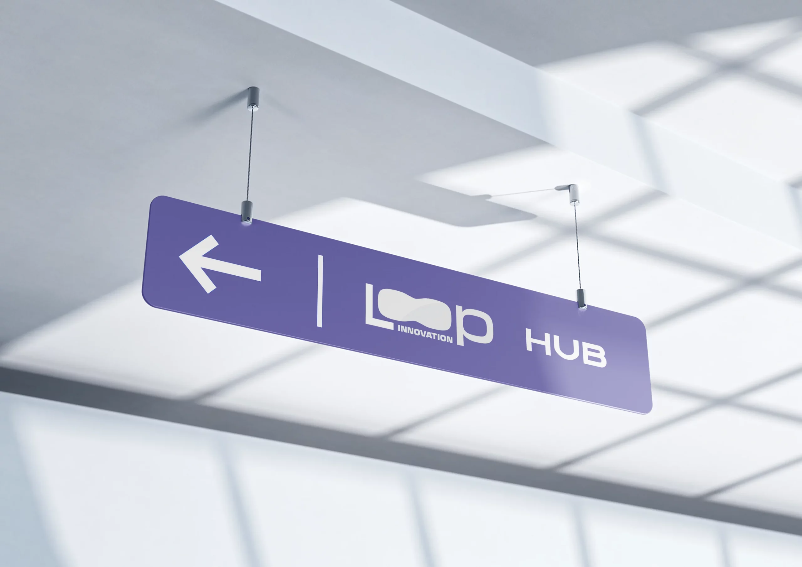
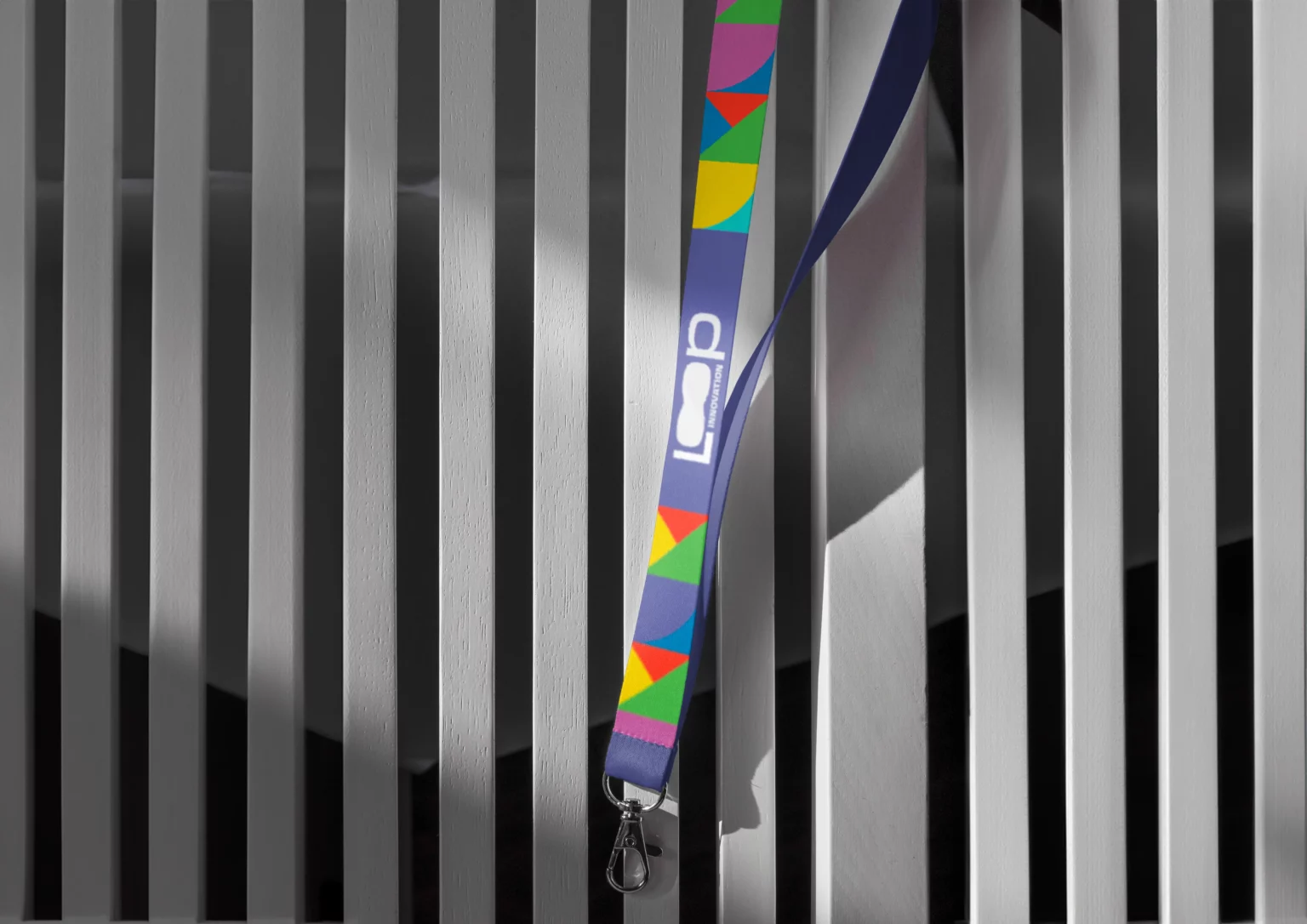
Loop Innovation Center is a Community Hub Space based in the entrance of Tirana

Challenge
1. Project Brief & Research
To start, I met with the Loop Innovation Center team to understand their vision. As an innovation hub, their goal was to represent continuous growth, forward-thinking, and technological advancement. I researched similar brands, particularly those in tech and innovation, to identify trends and opportunities for a unique design approach. This research laid the foundation for a logo that feels progressive and aligns with the values of innovation and continuity.

Goal
Concept Development
Inspired by the concept of a “loop” as a symbol of continuity, I began sketching initial ideas that visually expressed movement and connectivity. My exploration focused on integrating an abstract loop symbol with a bold, modern typeface. I created several drafts, experimenting with forms that felt dynamic yet professional, seeking a balance that would convey both creativity and stability.
Result
3. Design Refinement
After presenting initial concepts to the team, we selected a version where the loop symbol replaces the “O” in “Loop.” This design not only symbolizes continuous innovation but also serves as a memorable focal point in the brand name. I refined the shape of the loop to give it a sleek, modern look, aligning with the aesthetics of a forward-looking innovation center. To enhance readability and impact, I adjusted font weights and proportions.
Result
4. Color & Typography
The color palette went through careful selection. We chose a deep, modern blue as the primary color, symbolizing trust and innovation. For the typography, I opted for a bold sans-serif font to convey strength and professionalism, with “Innovation” placed subtly beneath “Loop” to emphasize the brand’s purpose without overwhelming the visual hierarchy.
